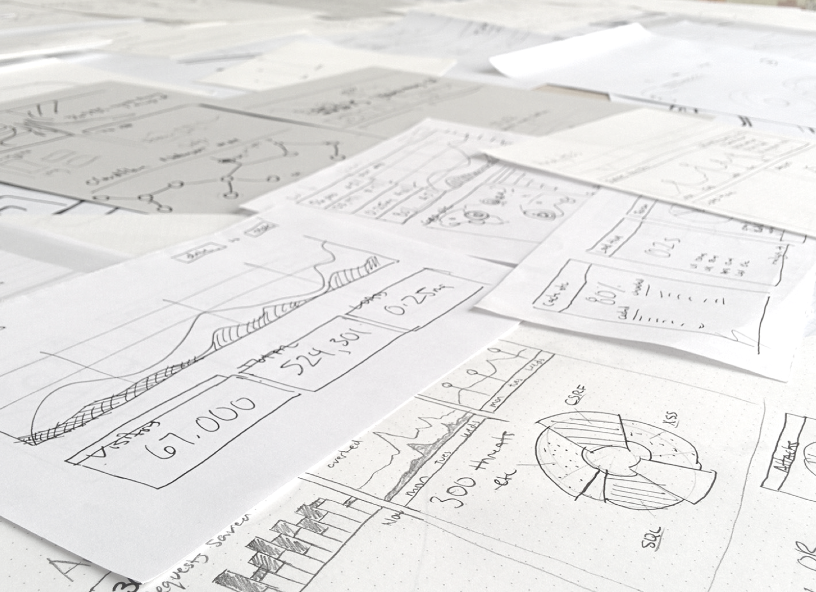
Initial sketches
The initial challenge was to educate the user on what exactly CloudFlare does. Is it speed? Is it security? Actually, it’s both. Informed from countless customer calls and support tickets, we were well familiar with how much people didn’t understand the dual value proposition of CloudFlare. There was a lot of discussion internally with how exactly to present it, and many discussions were focused around a single metric. Seeing the need to separate these two value propositions, I sketched out some ideas, and drafted up some wireframes to tell the story as clearly as I could.
Early wireframes
Early on, it was a blue sky project, many types of layouts and visual styles were explored. The stakeholders wanted to see all possible options, especially ones that could emphasize an impressive world map. I balanced this request against the ability to clearly communicate the values described above. Eventually, I came to the conclusion that the world map (unfortunately) would have to take a back seat to describing CloudFlare’s story.
Researching a style
As we began to hone in on the layout of the page, I researched some possible styles I wanted to incorporate. I wanted a visual style that felt clean, and modern. At this point, no stone was left unturned.
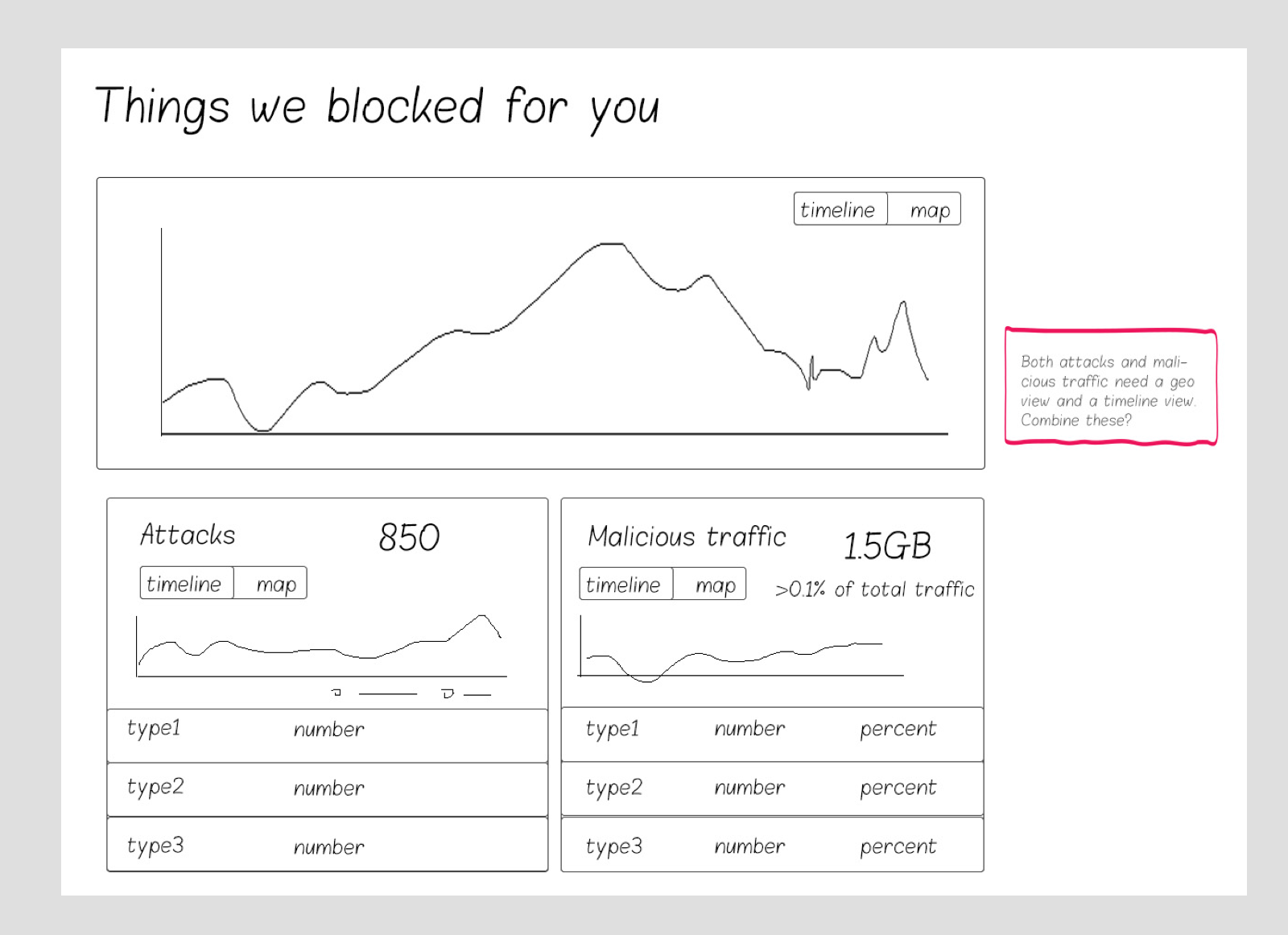
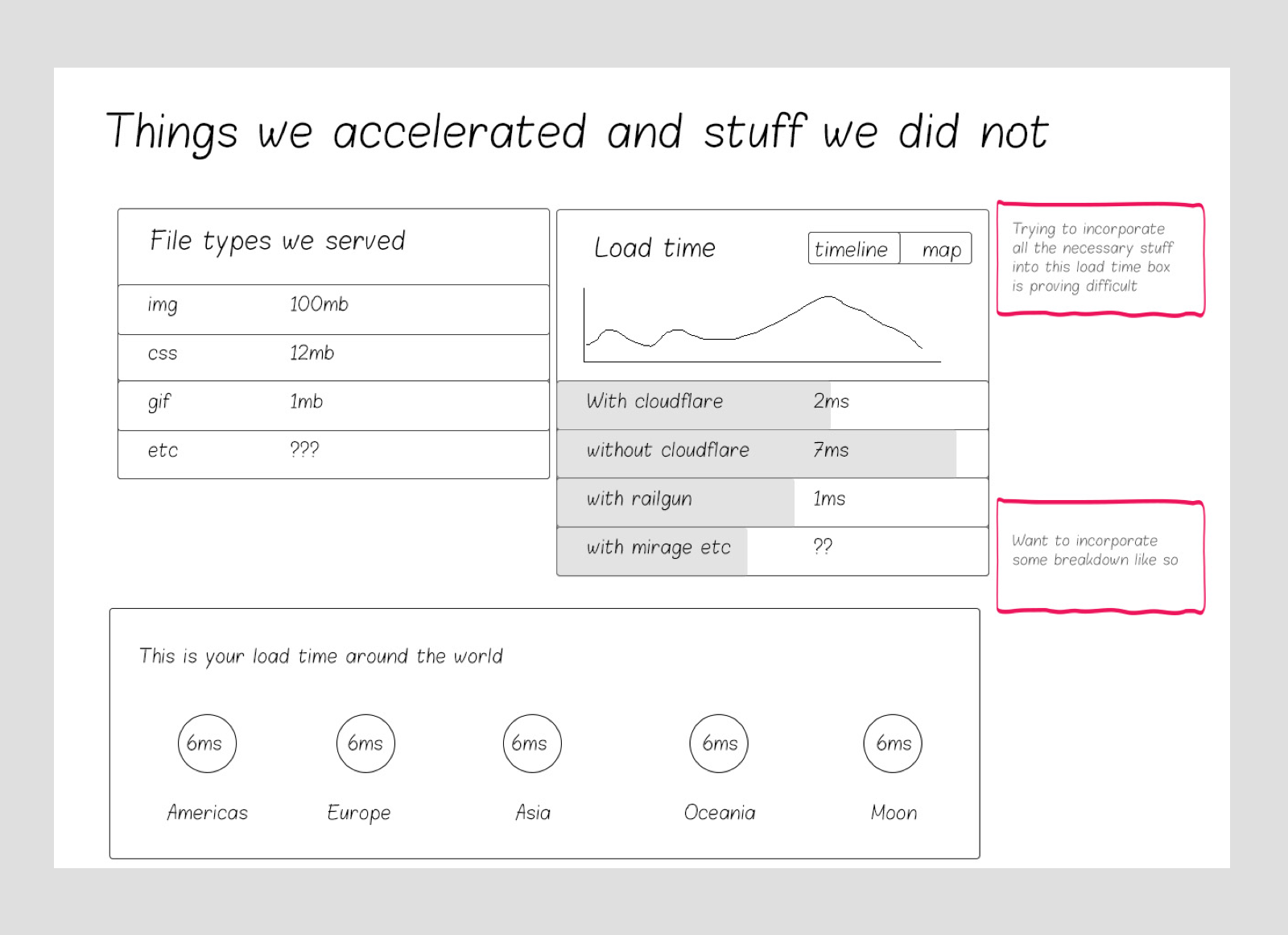
Trying to perfect the right diagram
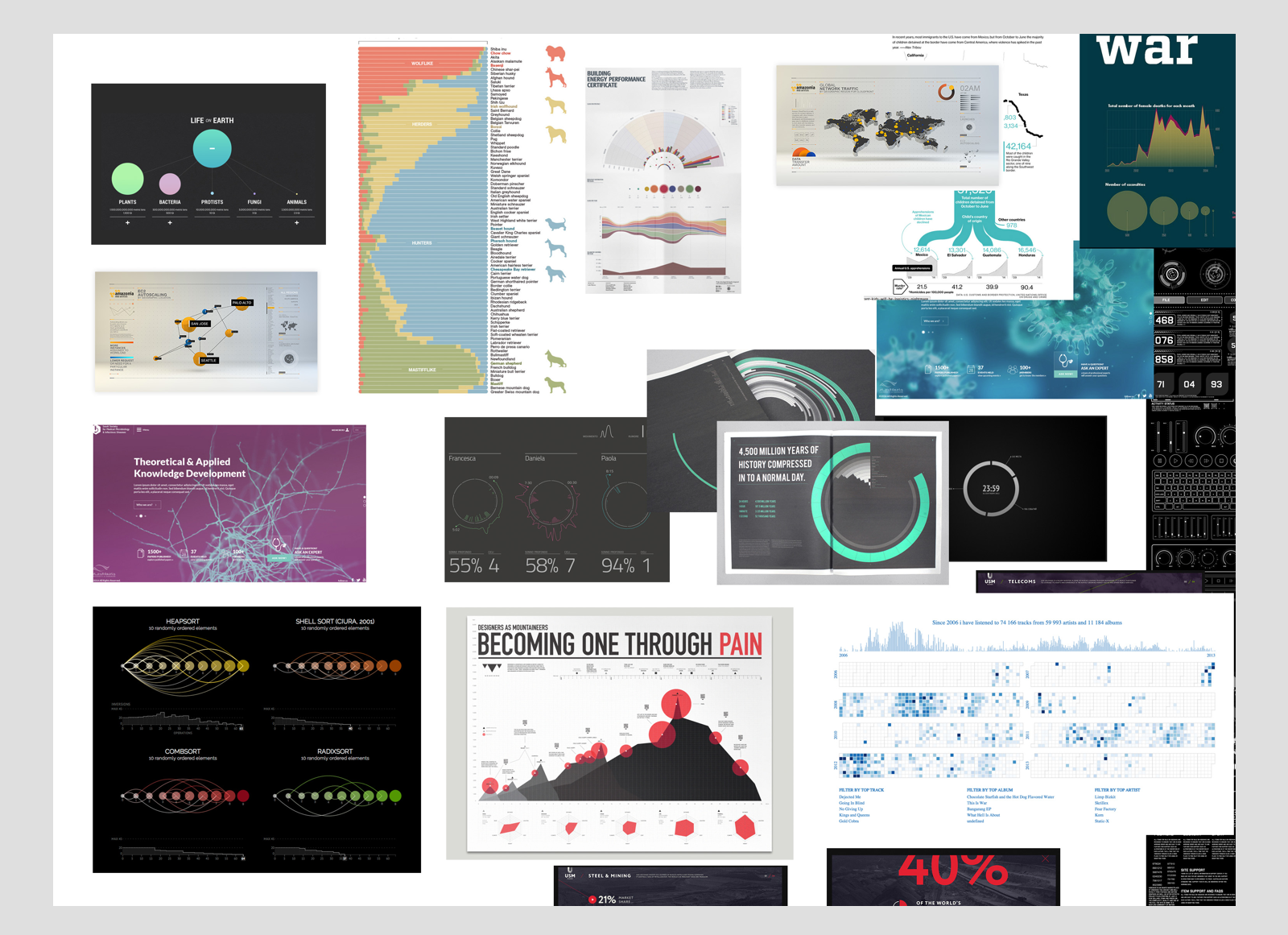
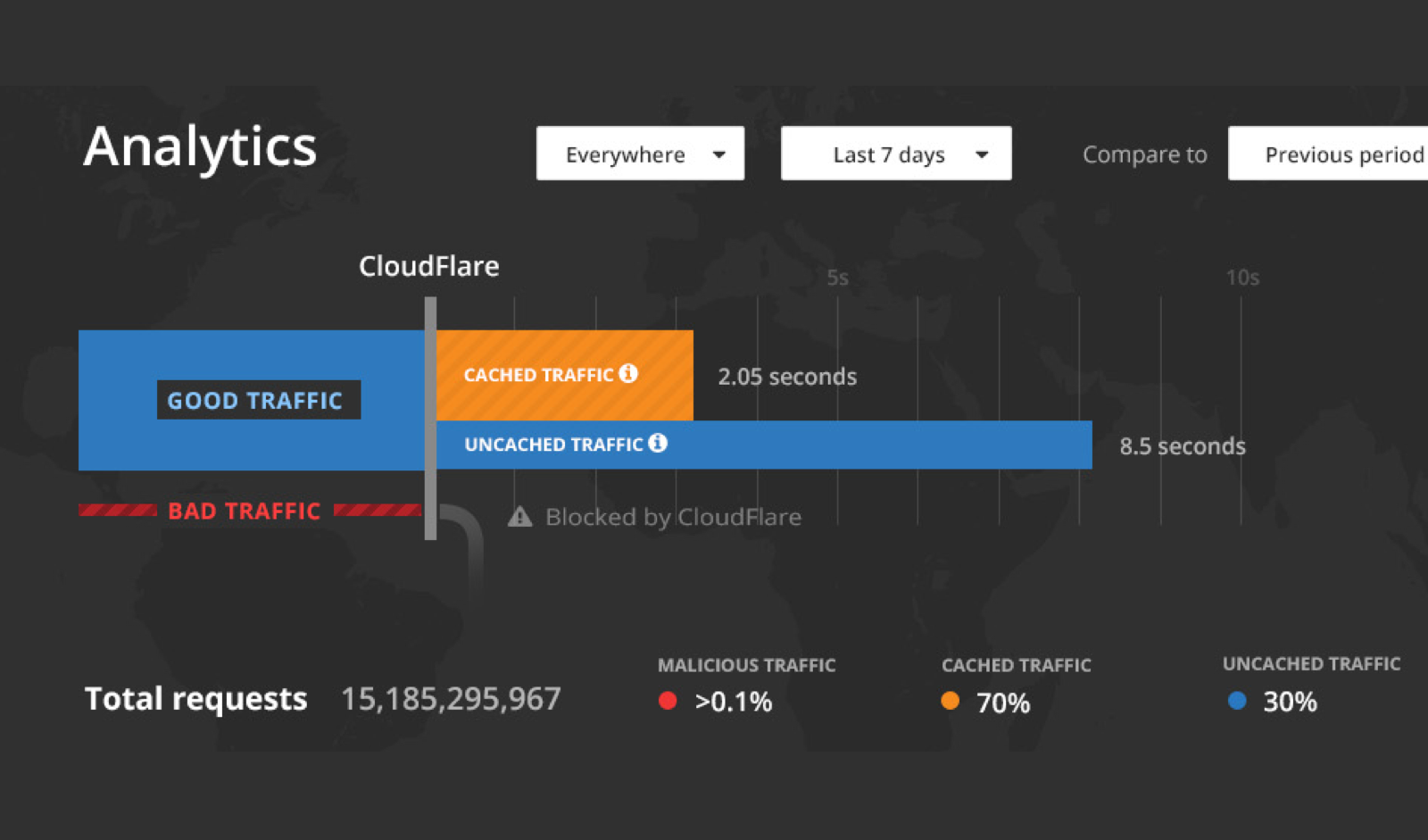
Throughout this process I was experimenting with the idea of an informative diagram. My theory was that the value of CloudFlare could be adequately told through a proper diagram that would not only deliver the necessary metrics, but illustrate exactly how things worked. I was trying to really clarify the scale between what was cached, and what was not, and show how the threat model fits into the network. While a useful exercise, these ideas were later scrapped for a more traditional chart, as things proved too over the top for a user to quickly grasp.
Returning to something more standard
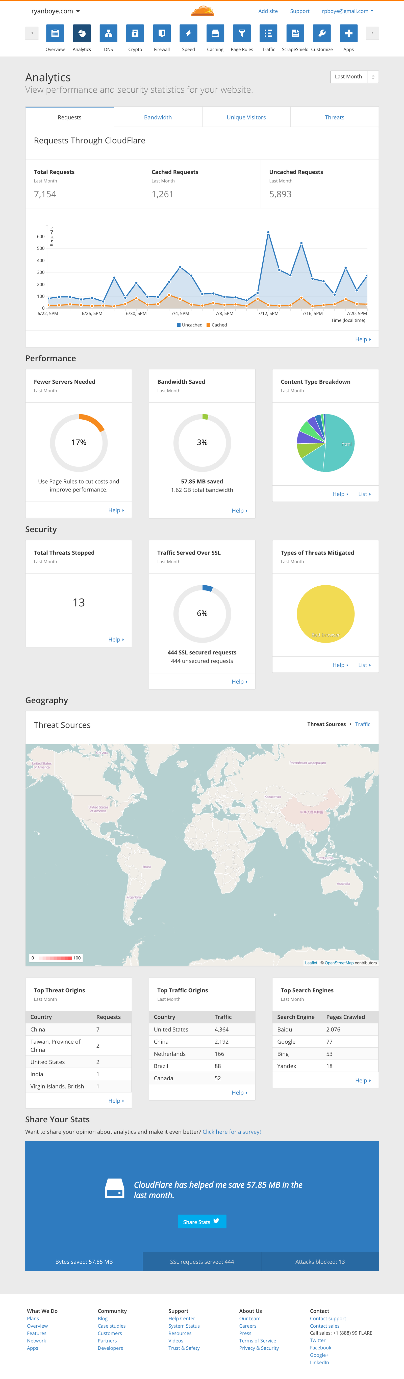
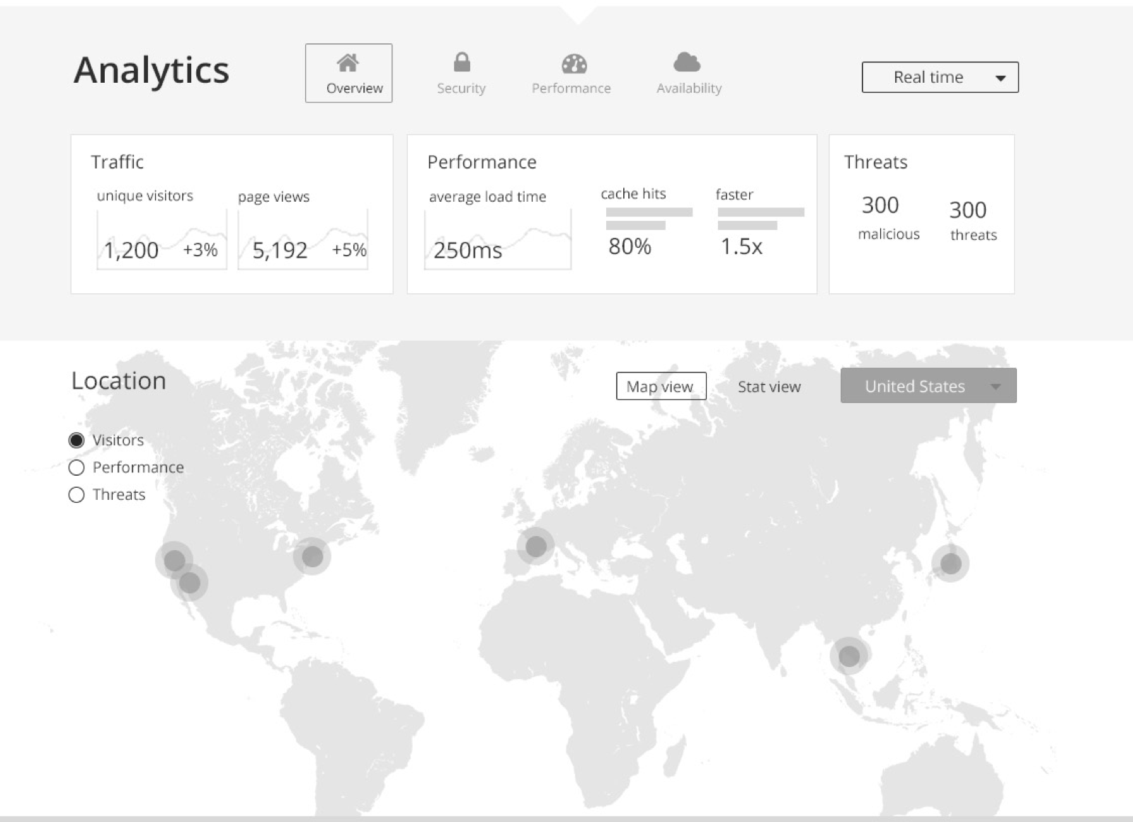
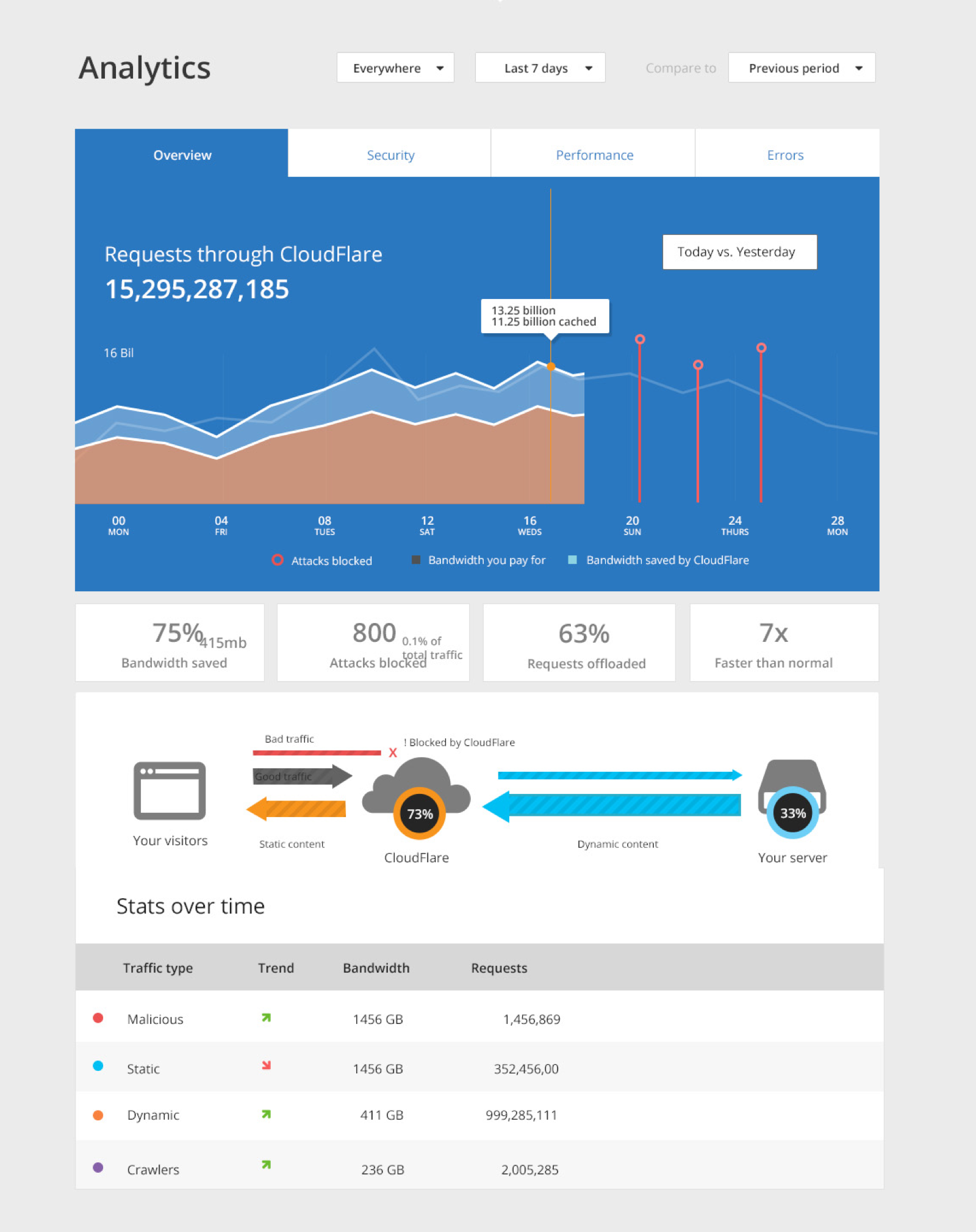
Eventually, we returned to something more standard. Through user testing, it became clear that the unconventional diagram was difficult to understand for most users. This gave me confidence to stick to a visualization that was more immediately readable by the average user. Something more standard ended up telling the story better.
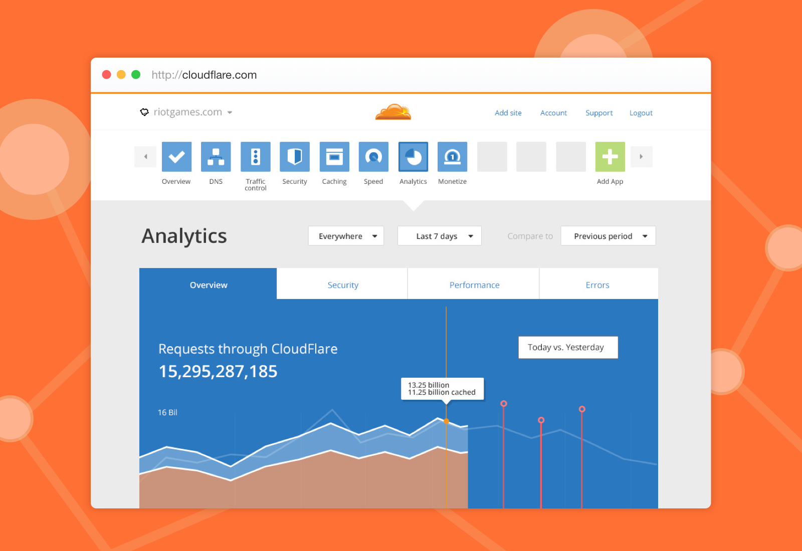
The final product
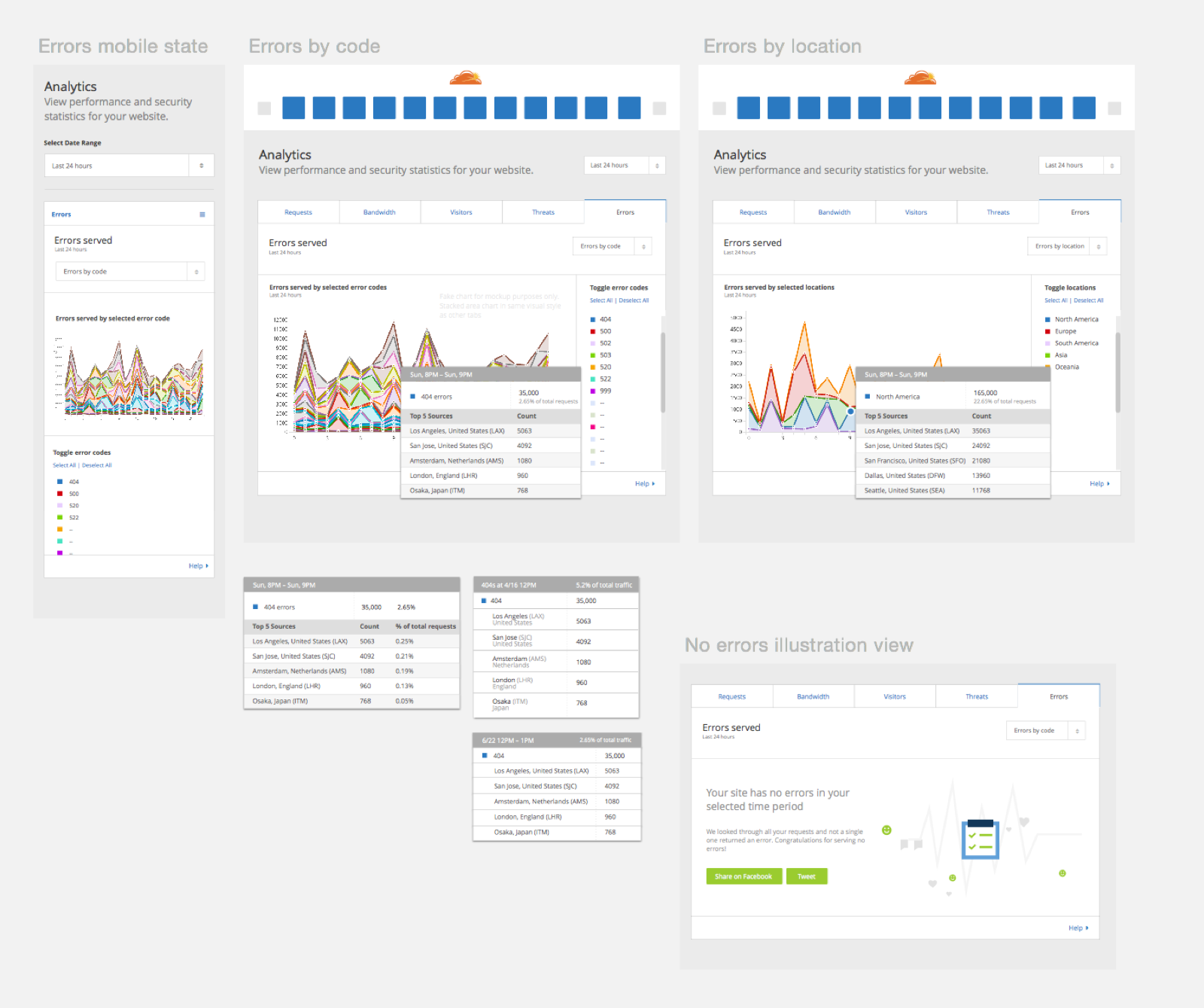
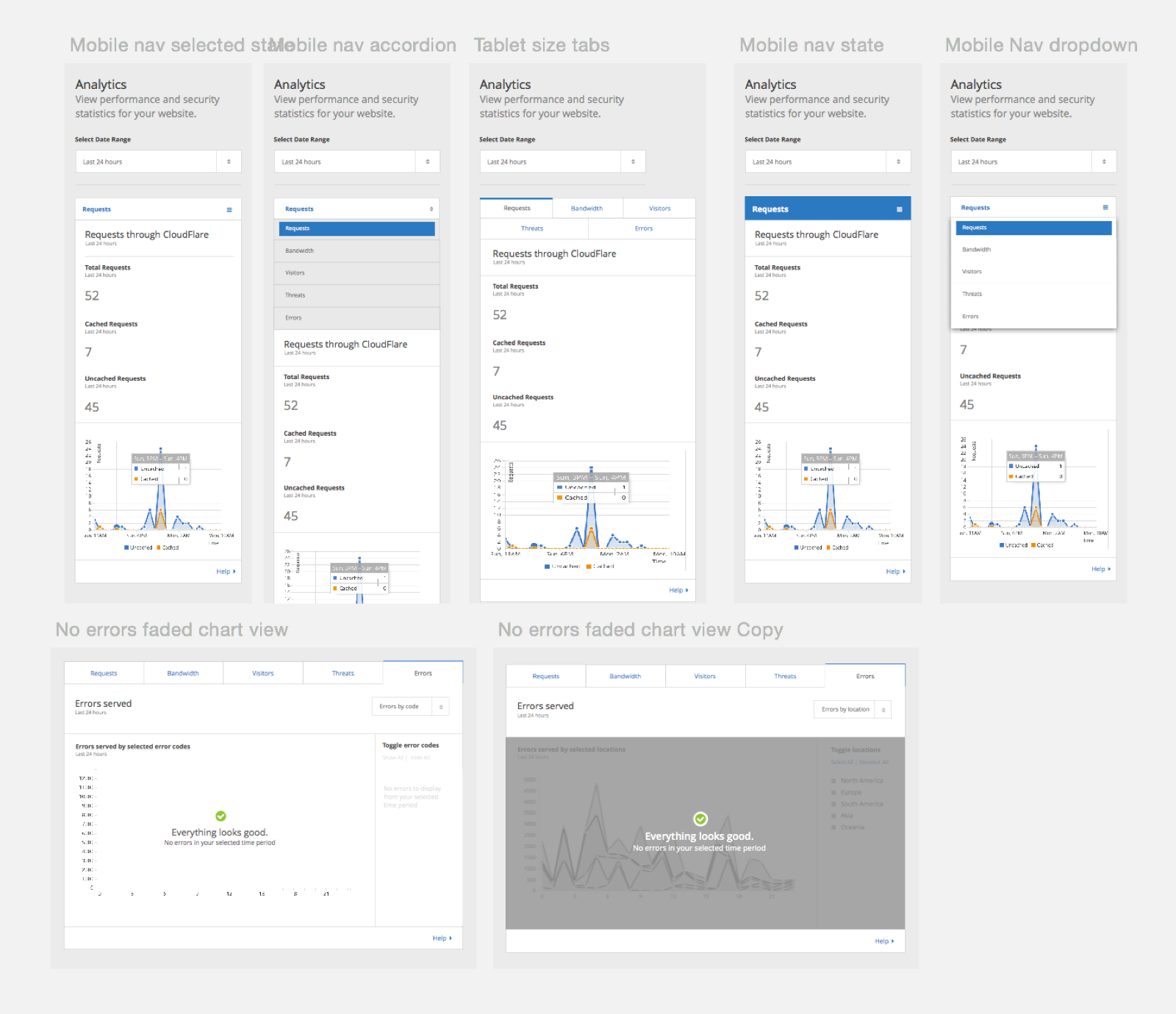
The final product was a responsive web analytics dashboard. Below you can see the spec I handed off to the developers, as well as a screnshot of the full page.