What we started with
The core product consists of question pages, and answer pages. Question pages can have multiple answers to that question. Answer pages have facts about the product. The primary goal was to increase user interaction on the website. To do that, we wanted to improve the rate that they clicked through past the homepage.
While the homepage featured large boxes showing the days most popular topics. It did not leave enough room to see multiple items on a page, and the hierarchy made things very difficult to read.
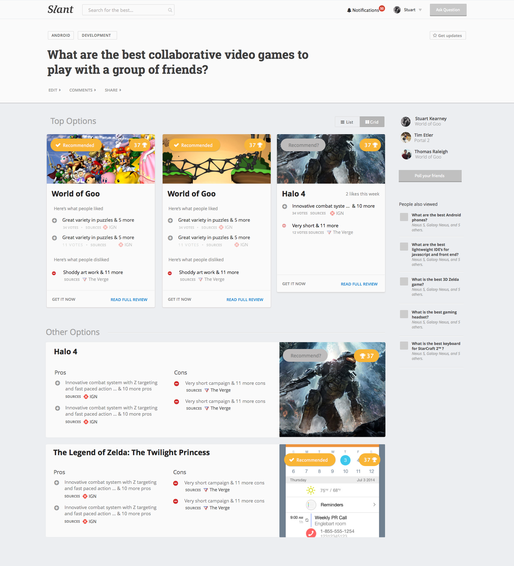
The original question page
The original question layout showcased different possible products, but made it hard to see multiple things at a glance. It was a poor use of space with low information density.
Iterating
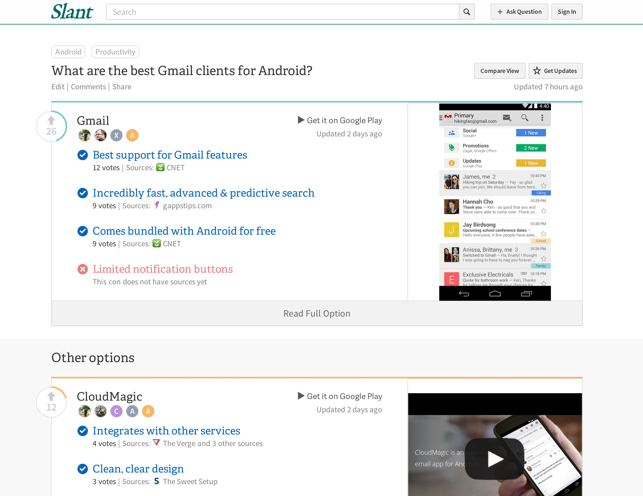
One of the challenges we tried to solve was how to improve the visual hierarchy on the homepage. Most importantly, how to solve the visual heirarchy of the questions listed.
The original, and two options are shown below. We took the original, and modified it so that the question felt like the most prominent aspect of the box. Everything else came after in the hierarchy. We introduced extra information from the answer page into this area, to clarify the options available to the user.
- Unclear what options are shown
- Unclear how well each option is doing
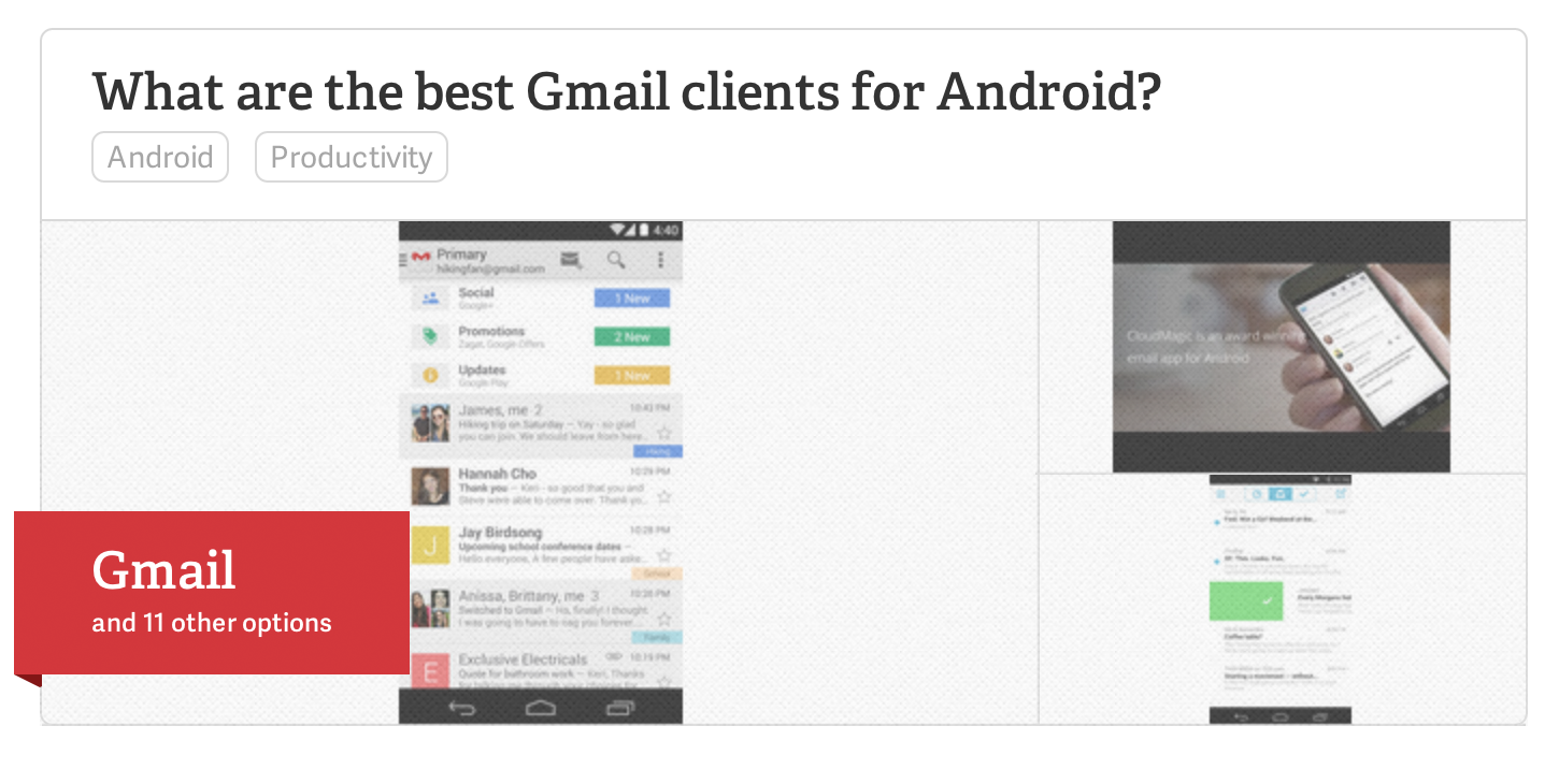
- Top answer is the most prominent part of the hierarchy, taking precedence over the question itself.
- Prominent list of top 3 answers to the question
- Clear indication of the category, and similar topics.
- Positive and negative votes for each answer is shown
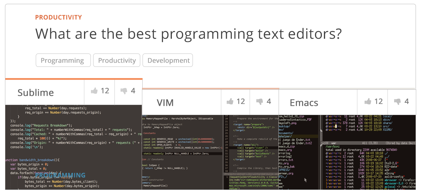
- Same as above, with further use of color, and votes shown next to the question.
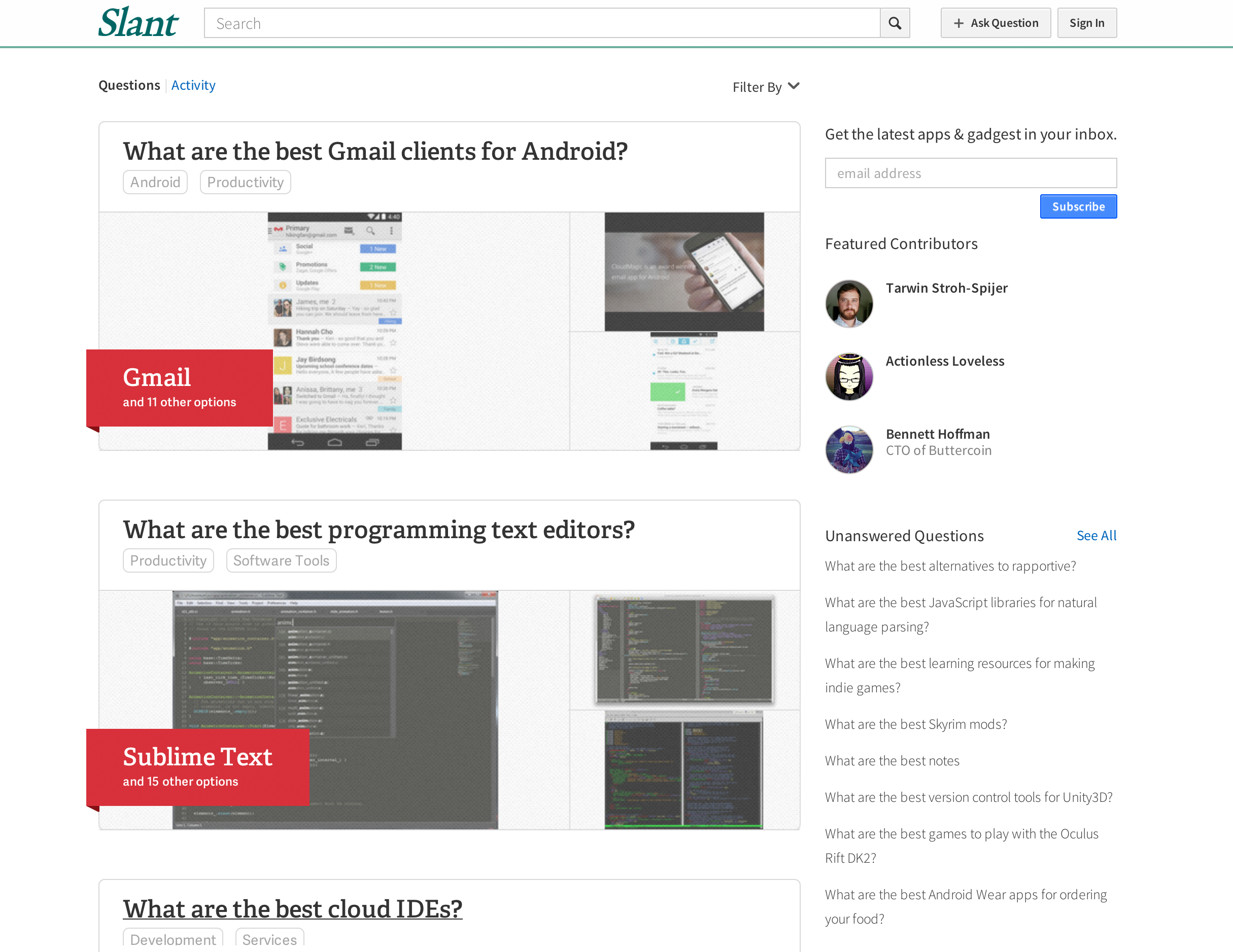
Iterating on the homepage
We experimented a lot with different styles of presenting the information. The goal was to convey to the user that there were many options available to them at a glance, and to convey the pros and cons of each one in a scannable way.
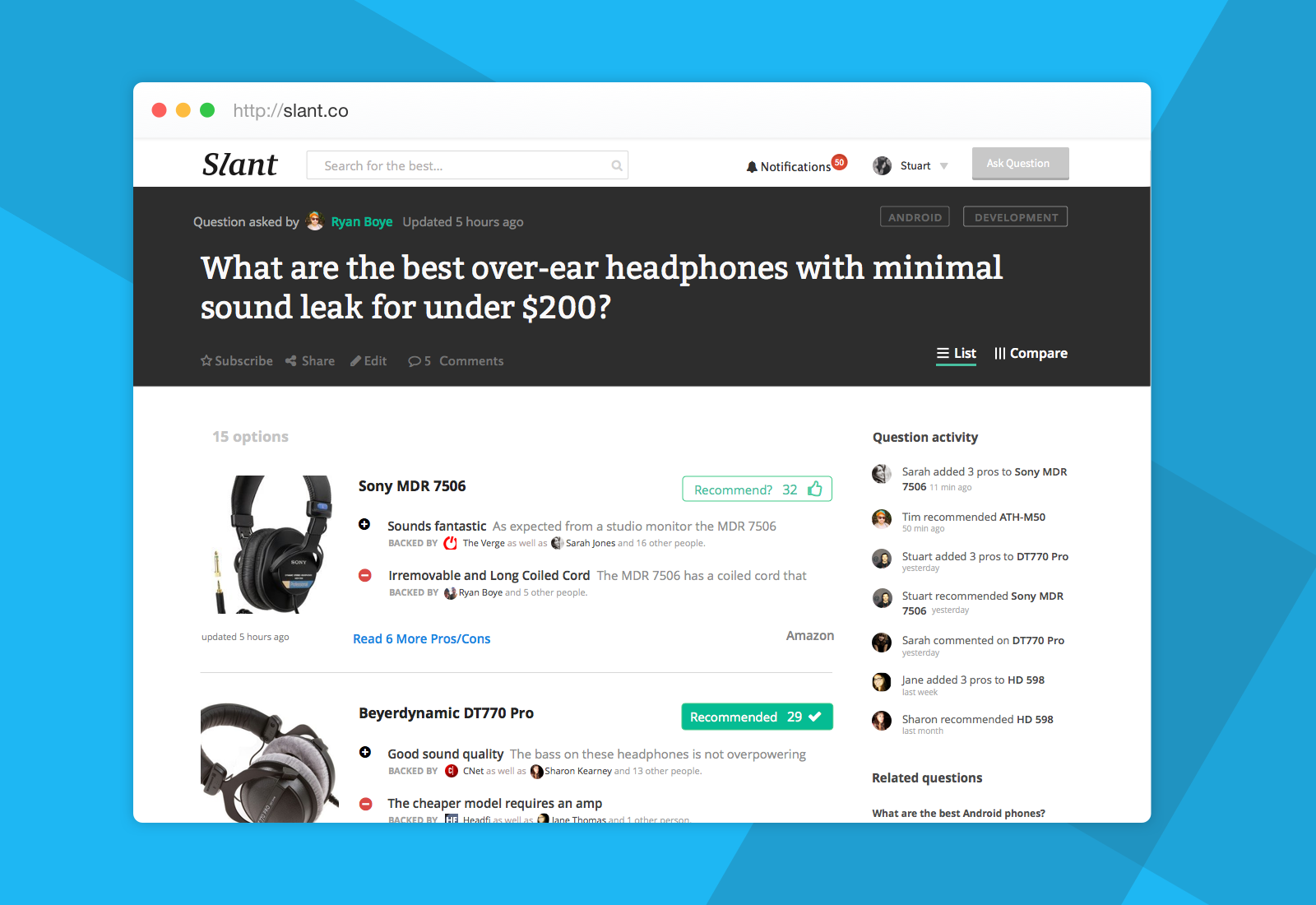
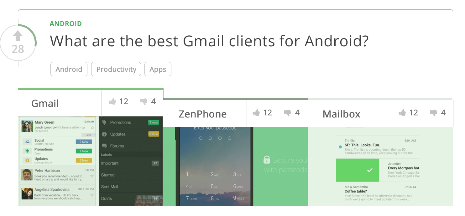
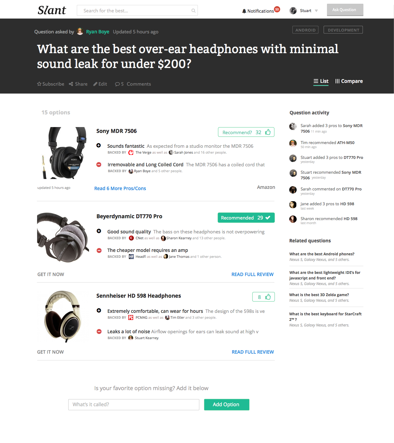
The Final Design
While the card approach seemed like a viable option, we ended up going with a more traditional list view. This design was based heavily off of the original, but with a more compact layout and higher information density. The result is cleaner and easier to scan.
Results
As soon as we launched the first iteration of the design (above), Slant was tremendously happy with the results, citing the redesign as having caused over 200% increase in user engagement month over month.