The problem
Gaming news has always poorly designed and esports rarely got any coverage of its own. Articles were a poor reflection on the gravity of the content they were trying to portray. GLHF was a new take on gaming news.
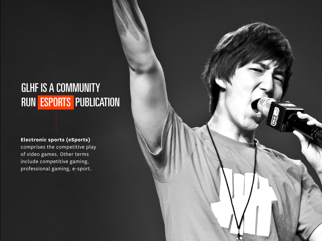
We covered the electronic sport side of things. We focused on the people, their stories, and the community that surrounds these games. We were trying to bring design into gaming, present their news in a way they’ve never seen it before, and provide a foundation on which eSports can grow.
The team
With only 5 core contributors, we all wore a lot of hats at GLHF. Each issue came together from managing over a hundred writing submissions that had to be reviewed and approved. Volunteer photographers, artists, and designers had to be coordinated to gather or create content to go with much of the writing.
The issue process
Every issue of GLHF took between 2-4 months to make. We started publishing once a quarter, because of all the man hours involved in getting an issue off the ground.
Each issue would often contain 2-3 main feature articles, often these were interviews with famous players or people in the eSports scene. We usually had a technology piece review with some equipment submitted by a sponsor, as well as a few strategy guide pieces, a letter from the editor, and some opinion pieces. Issues were often between 50 and 100 pages in length.
To see the full collection of issues, check out page on issuu
The brand
GLHF went through a full brand redesign when I came on board. To see the progression of the logo, and the various forms it went through before the final one, I’ve documented that process on Behance.
Covers
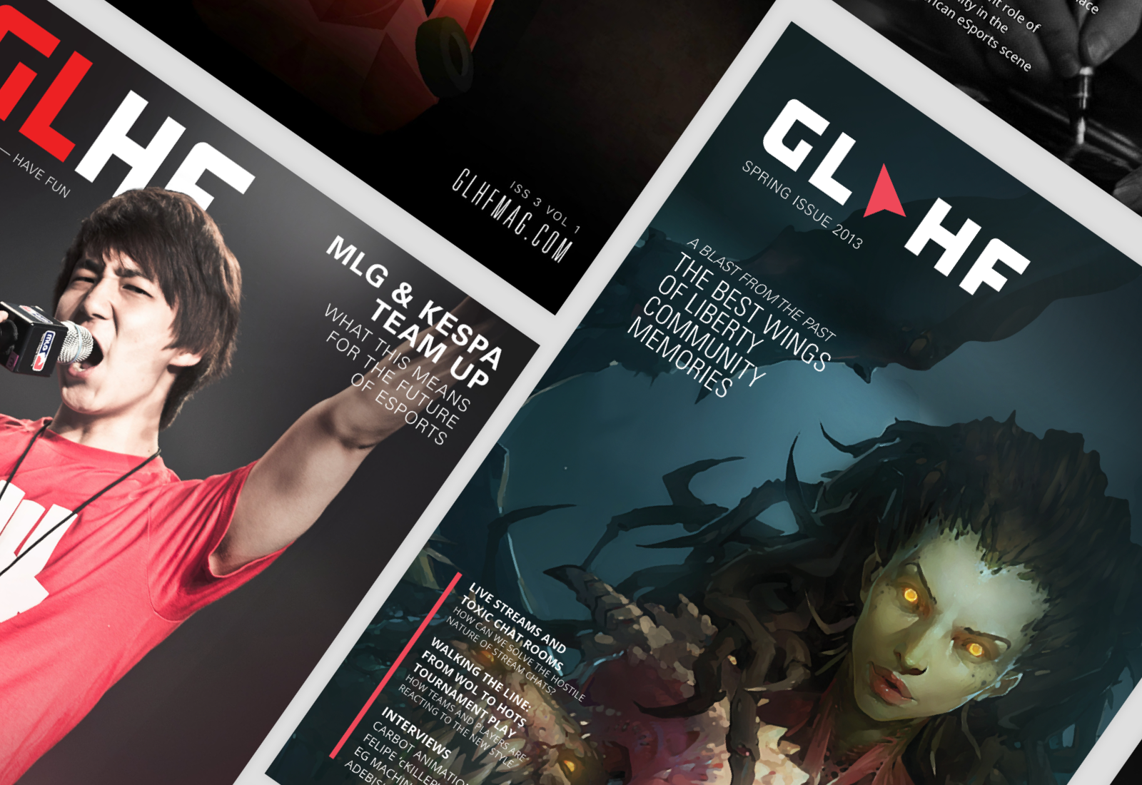
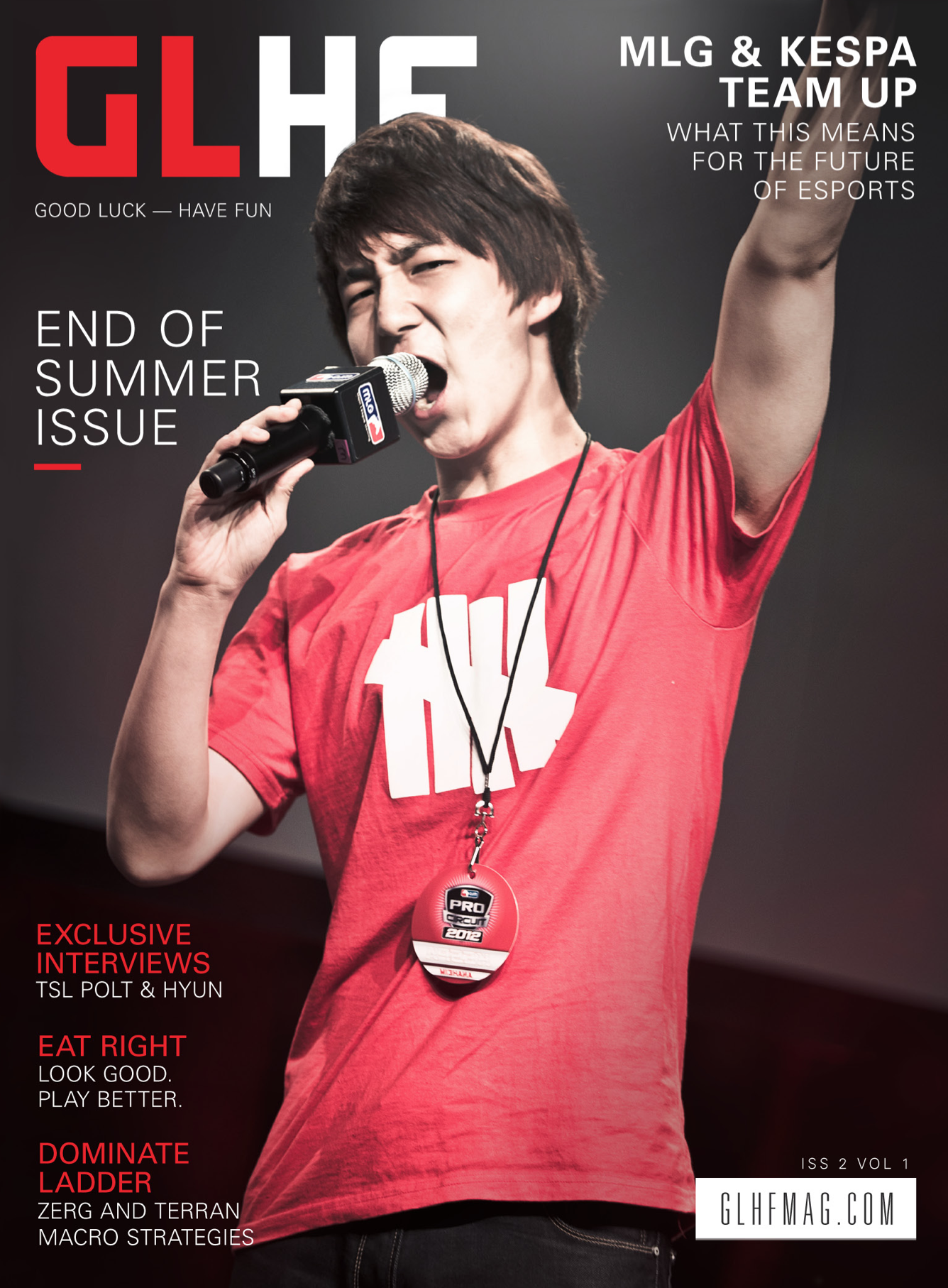
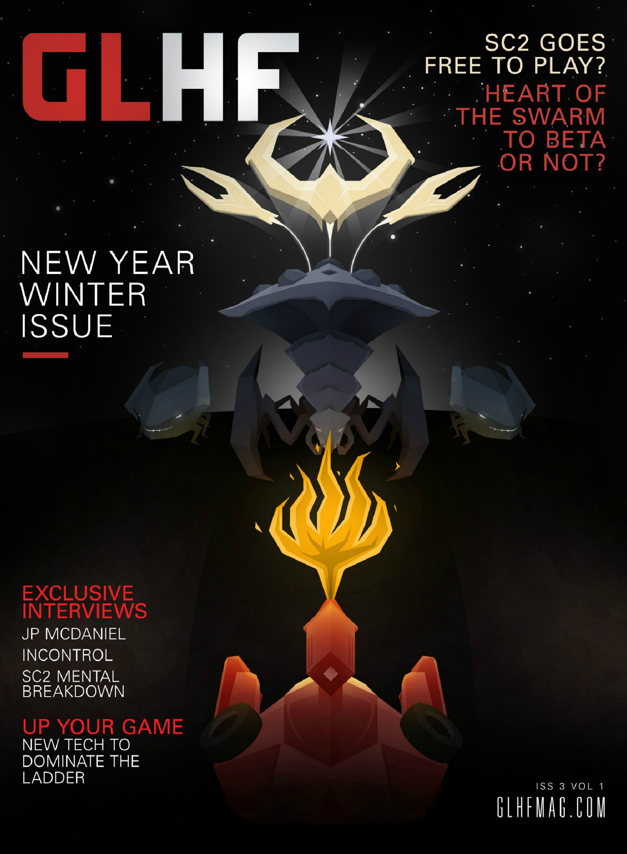
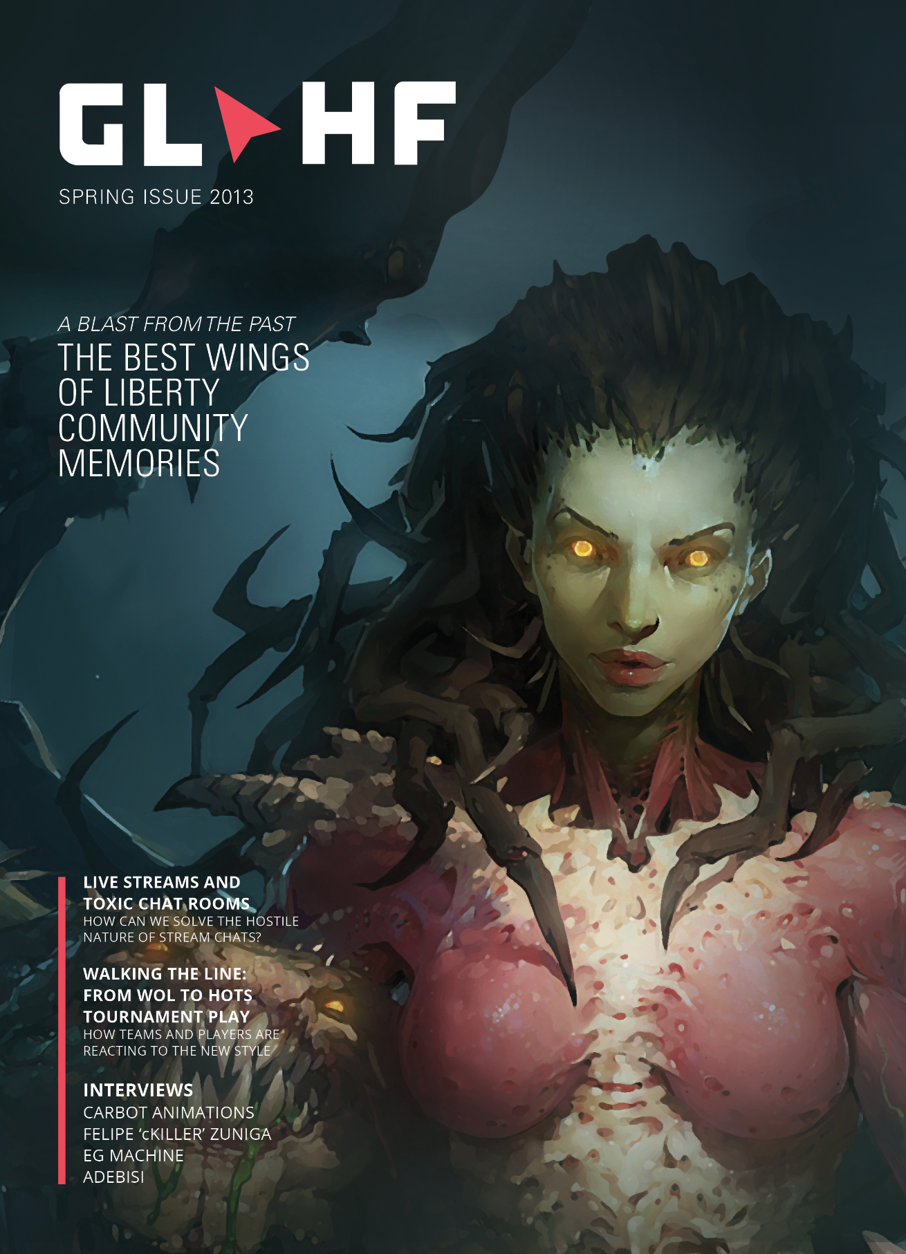
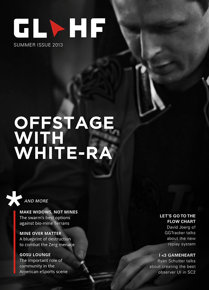
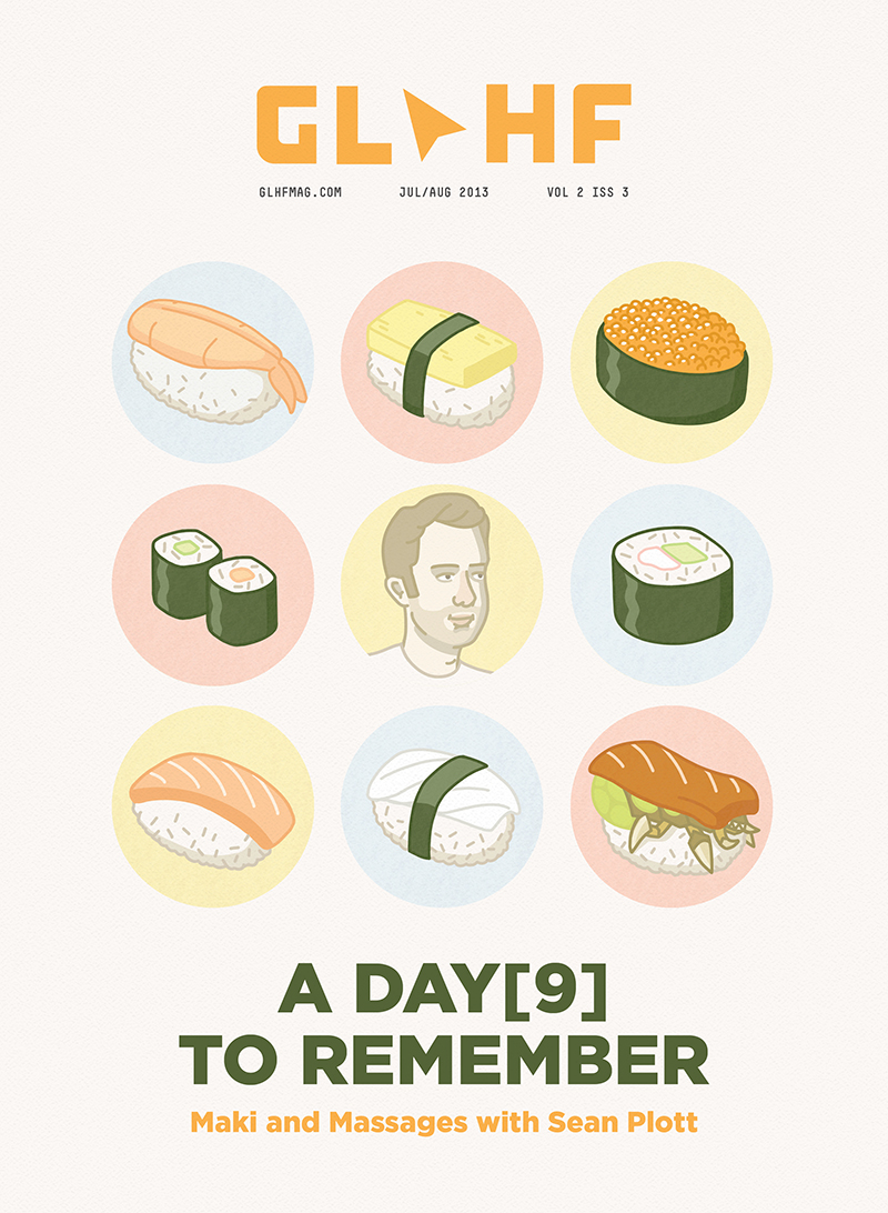
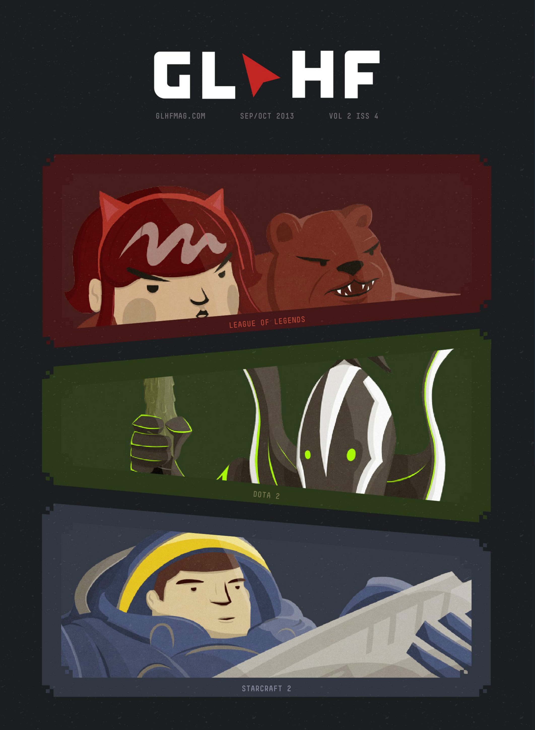
Each issue was themed around one flagship feature article. Every issue had a cover designed by hand to match. Some photography was taken by the team, some photos were submitted for us to use, and other covers were custom illustrated by a team member.
Selected spreads
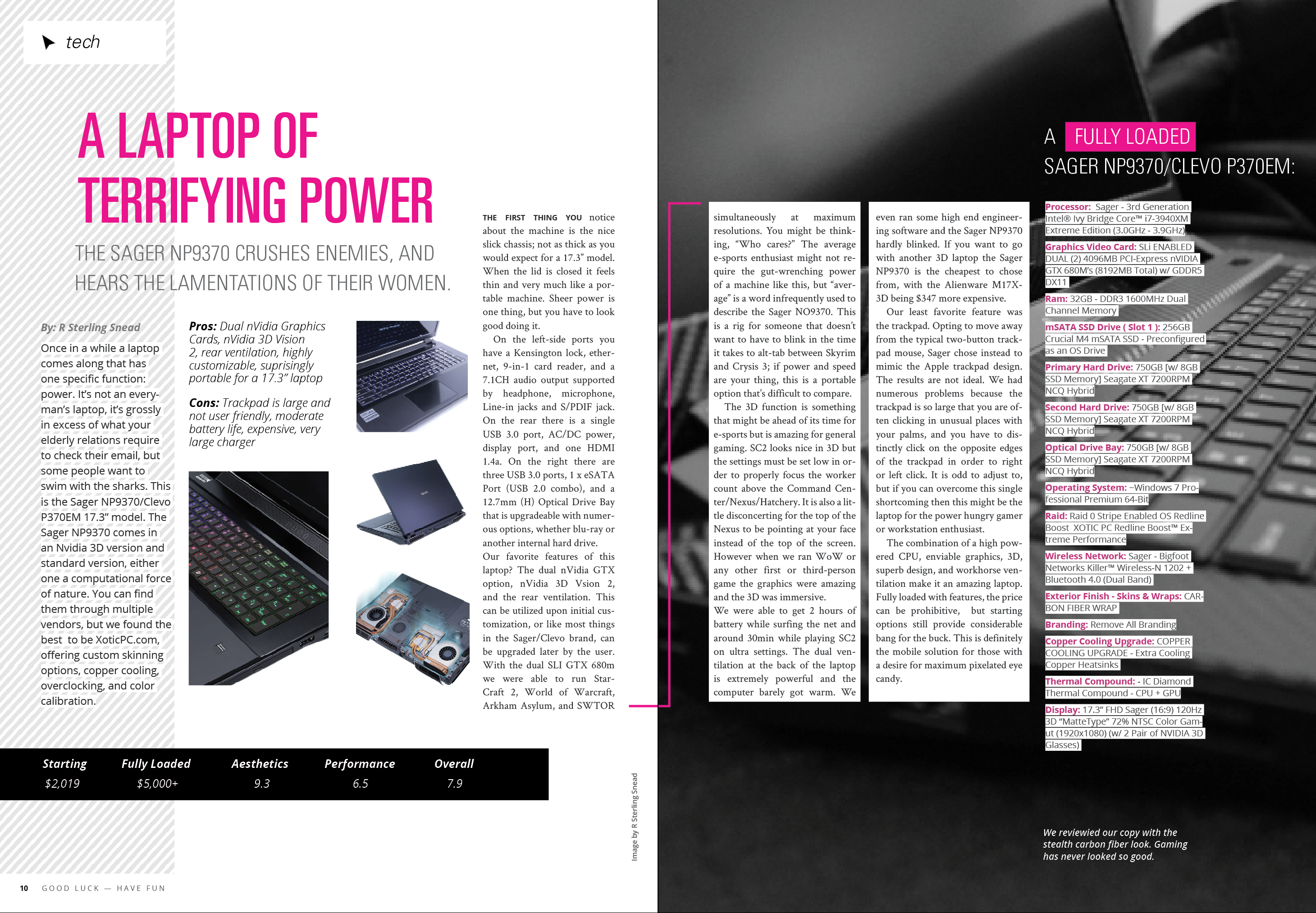
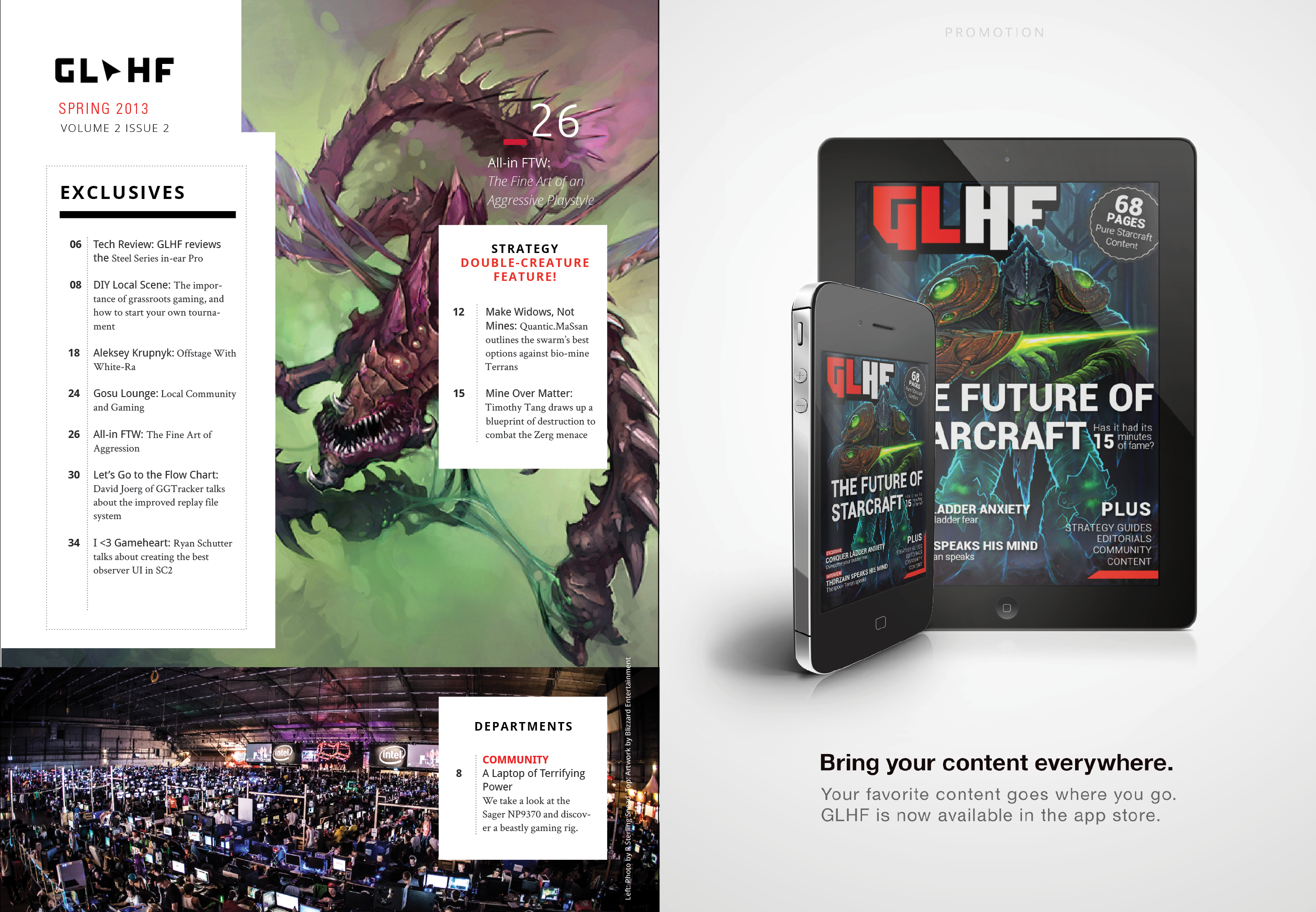
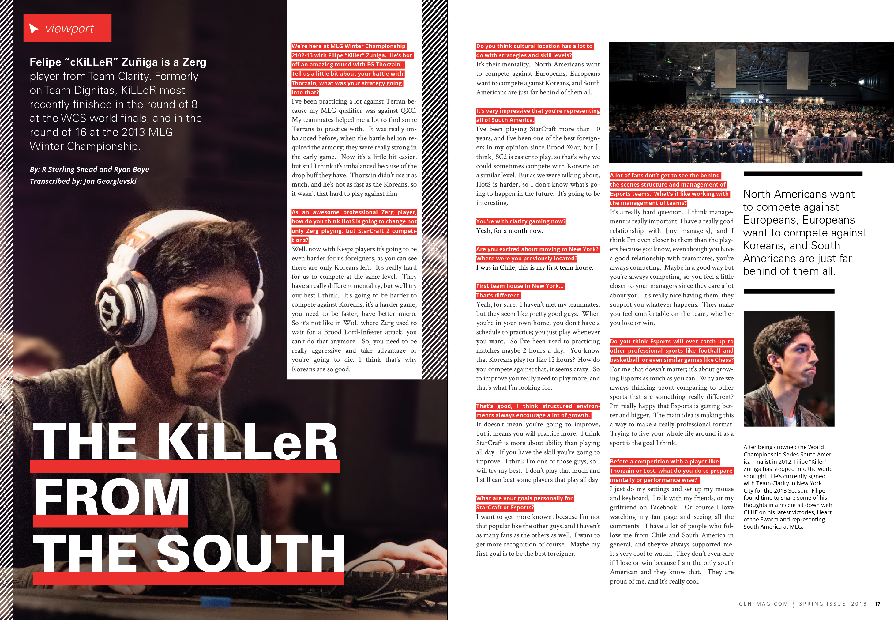
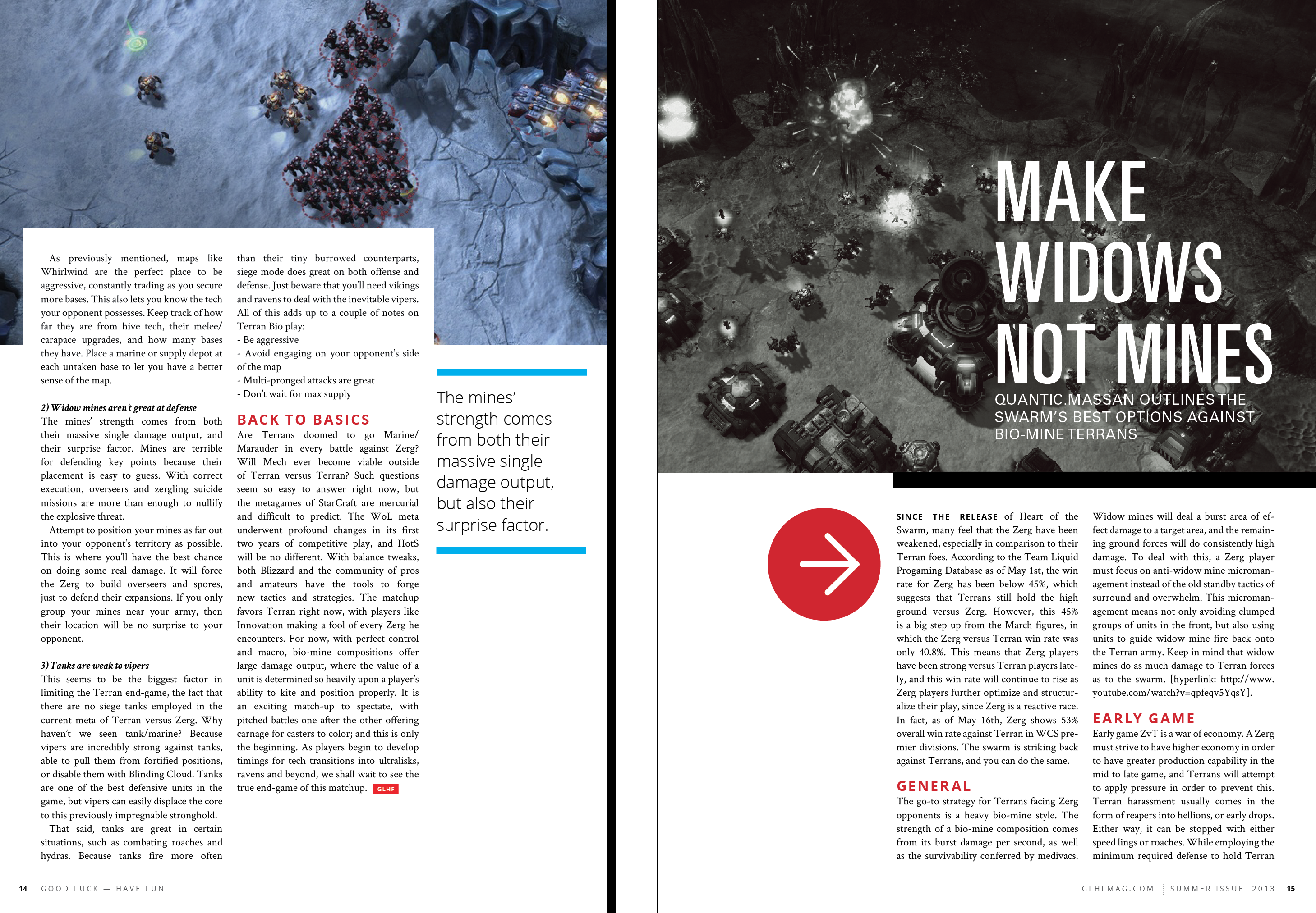
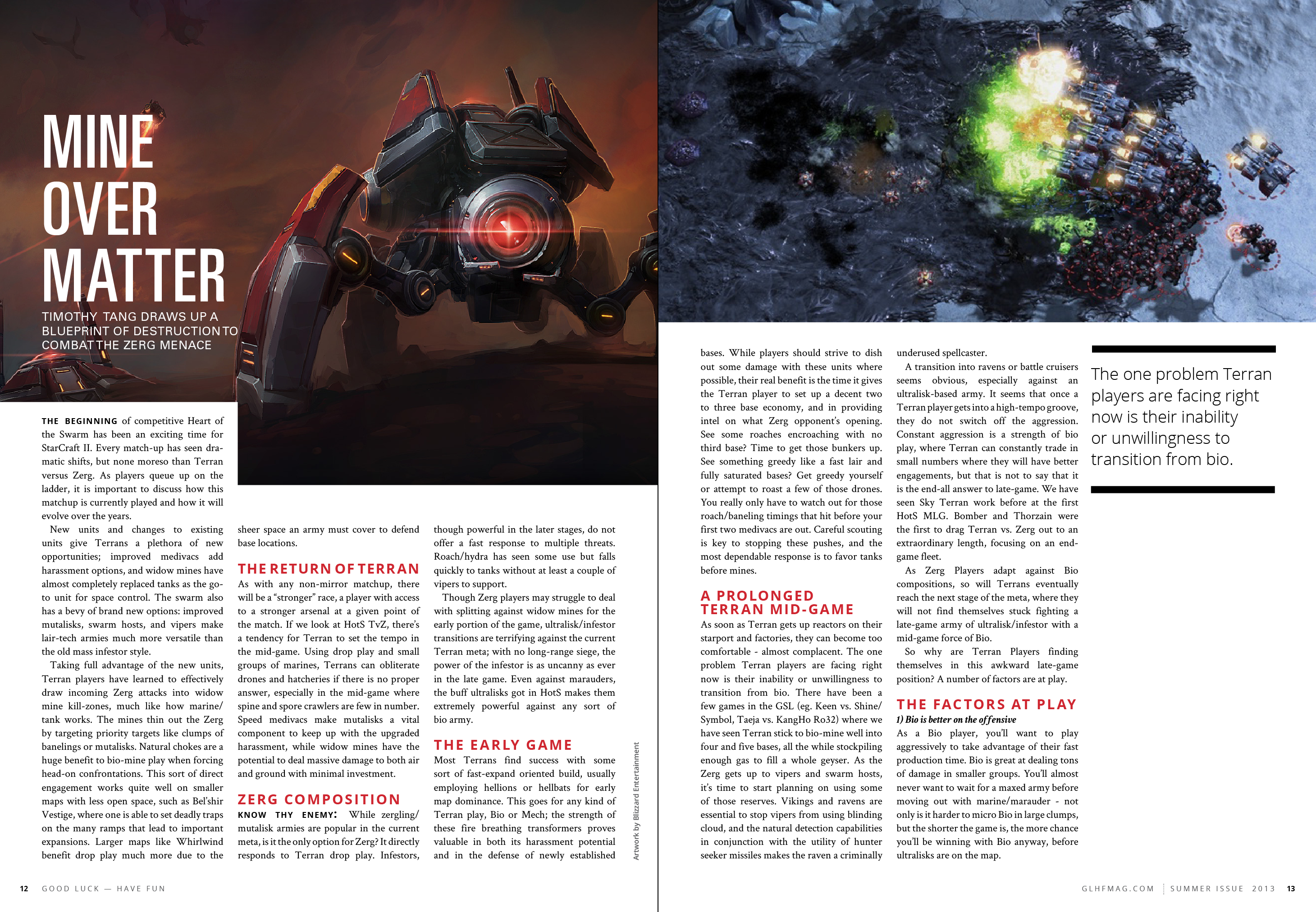
Every single issue, and every single article were all hand designed. It was most often myself working on the project, and sometimes overseeing one or two volunteer designers as well.
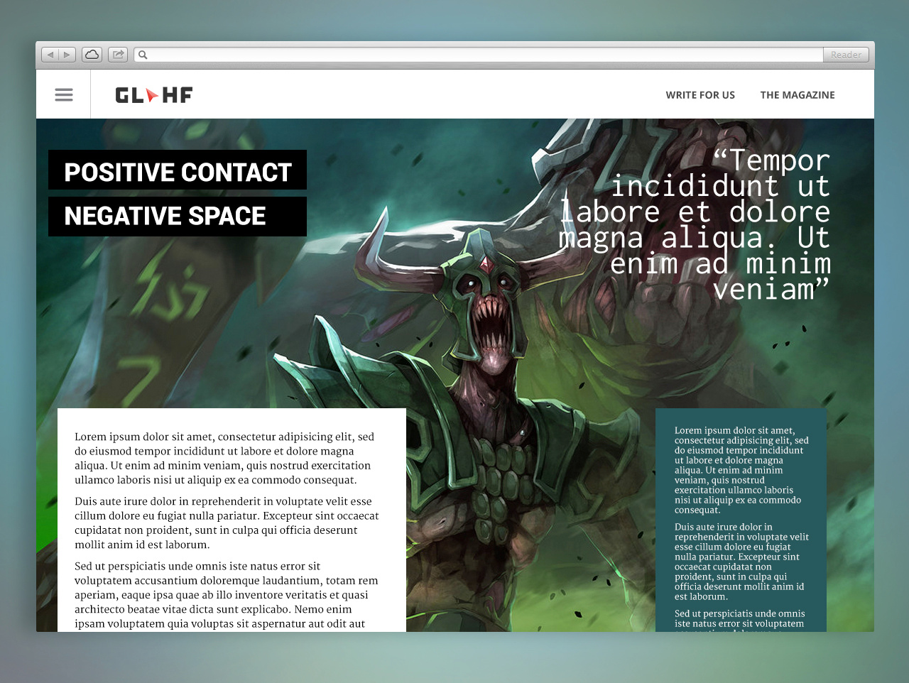
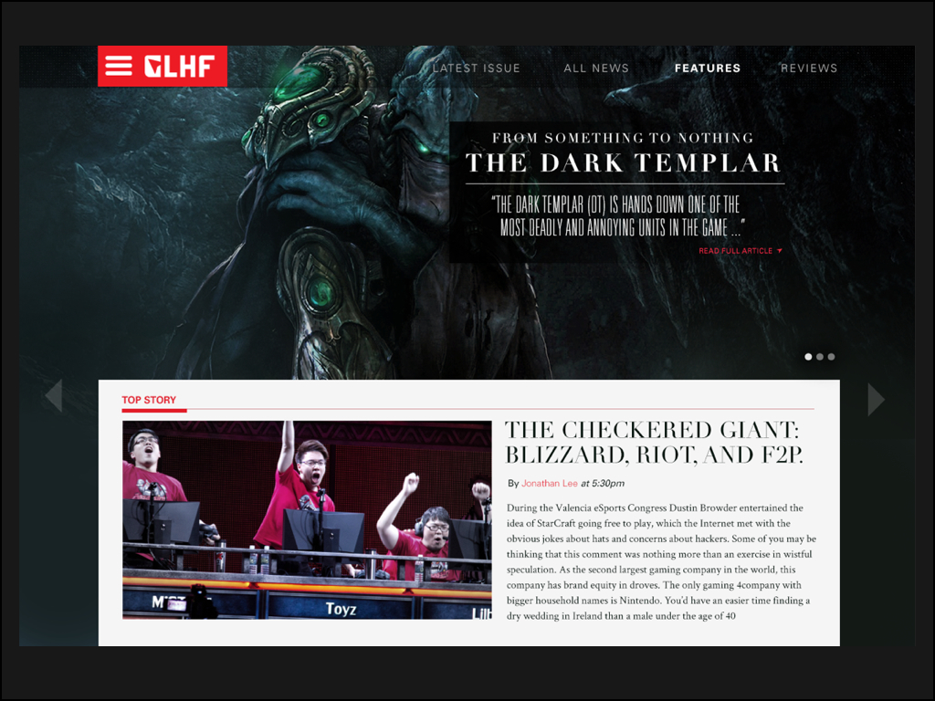
Interface Design, and the many iterations of the GLHF website
From the beginning, we knew that online pdf distribution was far from the best method to get our content to our fans. We had always wanted to start a news website, and went through a long design process (and development process) trying to find the one that felt right.
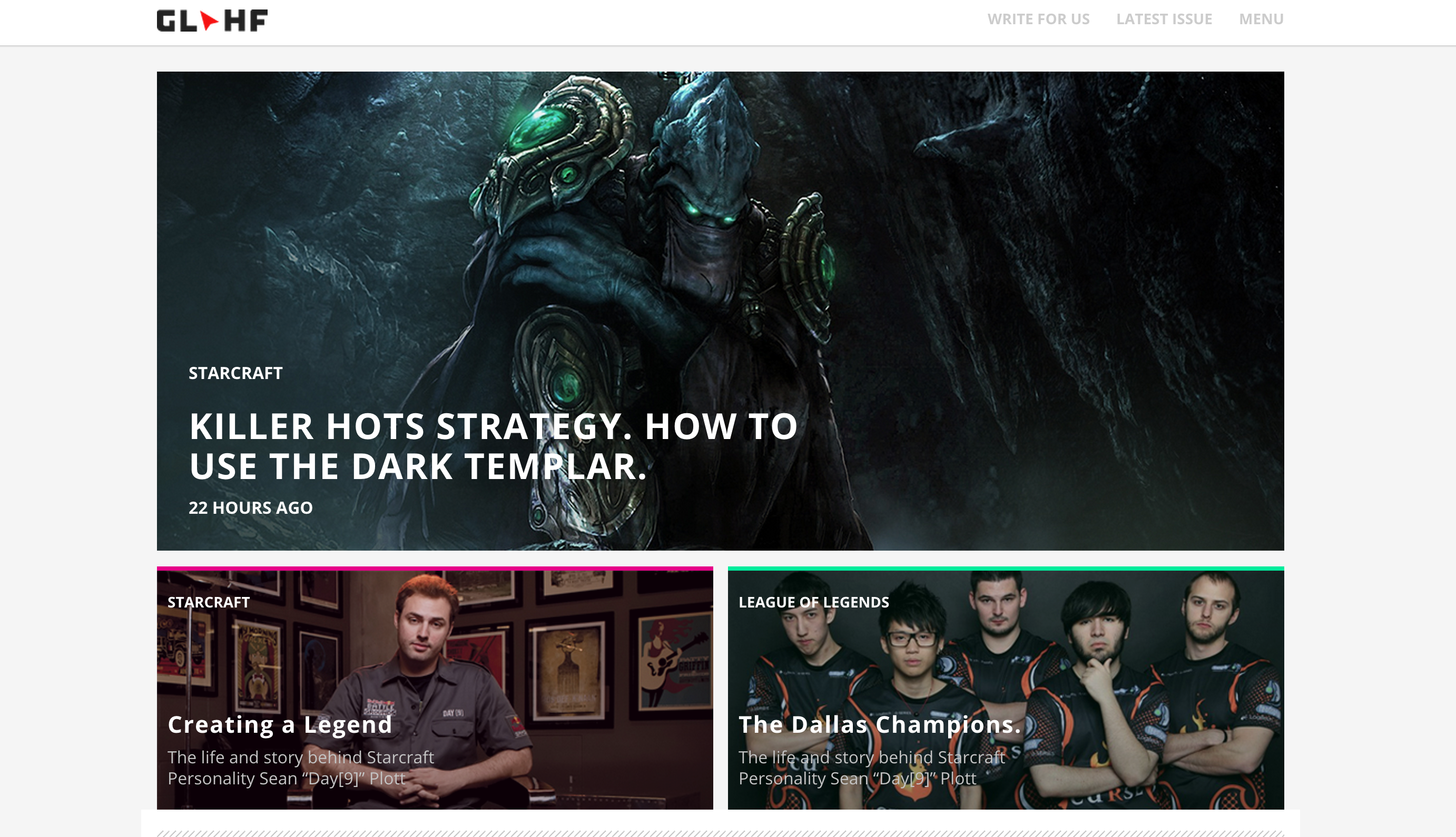
First designs of the GLHF article page
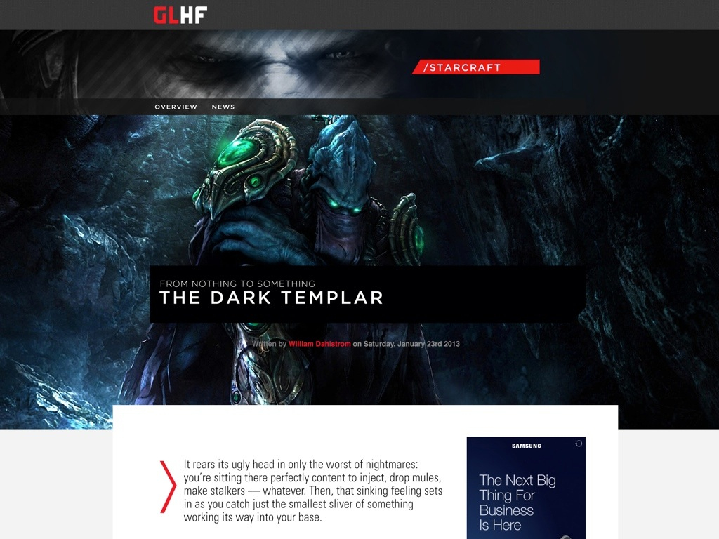
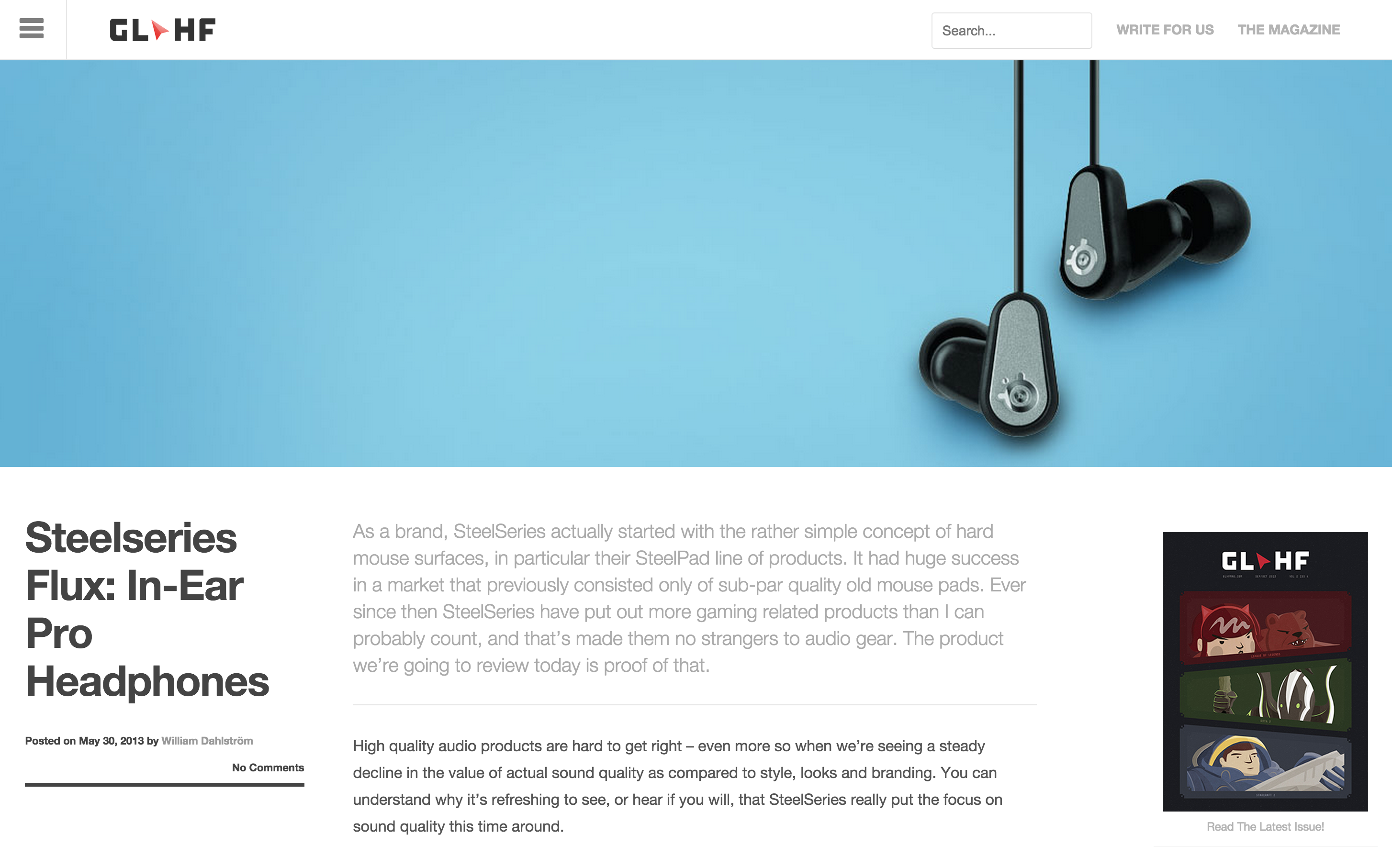
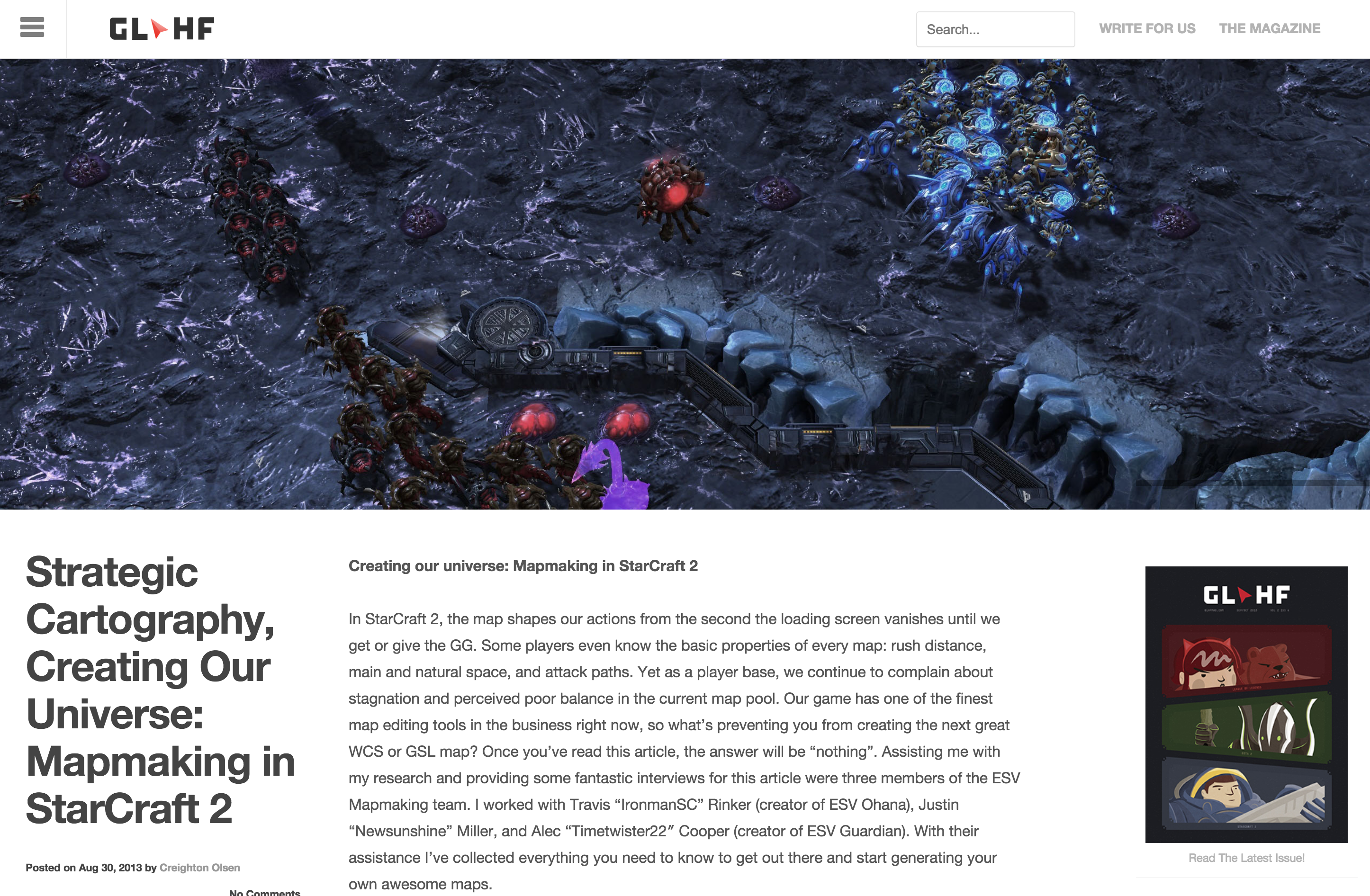
The final article page
